SPACEc: Cellular Neighborhood Analysis
# import spacec first
import spacec as sp

# silencing warnings
import warnings
warnings.filterwarnings('ignore')

#import standard packages
import os
import scanpy as sc

sc.settings.set_figure_params(dpi=80, facecolor='white')
INFO:root: * TissUUmaps version: 3.1.1.6
# Specify the path to the data
root_path = "/home/user/path/SPACEc/" # inset your own path

data_path = root_path + 'example_data/raw/' # where the data is stored

# where you want to store the output
output_dir = root_path + 'example_data/output/'
os.makedirs(output_dir, exist_ok=True)
# Loading the anndata from notebook 3 [cell type or cluster annotation is necessary for the step]
adata = sc.read(output_dir + 'adata_nn_demo_annotated.h5ad')
adata
AnnData object with n_obs × n_vars = 46789 × 59
    obs: 'DAPI', 'x', 'y', 'area', 'region_num', 'unique_region', 'condition', 'leiden_1', 'leiden_1_subcluster', 'cell_type_coarse', 'cell_type_coarse_subcluster', 'cell_type_coarse_f', 'cell_type_coarse_f_subcluster', 'cell_type_coarse_f_f', 'cell_type'
    uns: 'cell_type_coarse_f_colors', 'cell_type_colors', 'dendrogram_cell_type_coarse_f_subcluster', 'leiden', 'leiden_1_colors', 'neighbors', 'umap', 'unique_region_colors'
    obsm: 'X_pca', 'X_umap'
    layers: 'scaled'
    obsp: 'connectivities', 'distances'
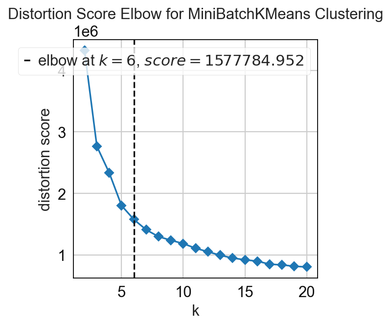
Cellular Neighborhoods analysis
In this step the cellular neighborhoods are calculated. For that, it is important to select a window size (k) and number of neighborhoods (n_neighborhoods). If the optimal number of neighborhoods is unknown, the elbow parameter can be used to calculate an optimal number of neighborhoods. For that, set the elbow parameter to True and n_neighborhood to the value that should be set as maximum (e.g. set it to 20 to test 1-20 neighborhoods).
# compute for CNs
# tune k and n_neighborhoods to obtain the best result
adata = sp.tl.neighborhood_analysis(
    adata,
    unique_region = "unique_region",
    cluster_col = "cell_type",
    X = 'x', Y = 'y',
    k = 20, # k nearest neighbors
    n_neighborhoods = 20, #number of CNs
    elbow = True)
Starting: 2/2 : reg001
Finishing: 2/2 : reg001 0.10058784484863281 0.10063290596008301
Starting: 1/2 : reg002
Finishing: 1/2 : reg002 0.055402278900146484 0.15645599365234375
# compute for CNs
# tune k and n_neighborhoods to obtain the best result
adata = sp.tl.neighborhood_analysis(
    adata,
    unique_region = "unique_region", # regions or samples
    cluster_col = "cell_type", # derive clusters from this column
    X = 'x', Y = 'y', # spatial coordinates
    k = 20, # k nearest neighbors
    n_neighborhoods = 6, # number of CNs (or max number of CNs for elbow plot)
    elbow = False) # if True, will plot the elbow plot
Starting: 2/2 : reg001
Finishing: 2/2 : reg001 0.09681224822998047 0.09685802459716797
Starting: 1/2 : reg002
Finishing: 1/2 : reg002 0.05829811096191406 0.1560065746307373
# to better visualize the cellular neighborhood (CN), we choose a color palette
# but if you set palette = None in the following function, it will randomly generate a palette for you
cn_palette = {
    0: '#829868',
    1: '#3C5FD7',
    2: '#44CB63',
    3: '#FDA9AA',
    4: '#E623B1',
    5: '#204F89'}

# save the palette in the adata
adata.uns['CN_k20_n6_colors'] = cn_palette.values()

# plot CN to see what cell types are enriched per CN so that we can annotate them better
sp.pl.cn_exp_heatmap(
    adata, # anndata
    cluster_col = "cell_type", # cell type column
    cn_col = "CN_k20_n6", # CN column
    palette=cn_palette, # color palette for CN
    savefig = False, # save the figure
    output_dir = output_dir, # output directory
    rand_seed = 1 # random seed for reproducibility
)

sp.pl.catplot(
    adata,
    color = "CN_k20_n6", # specify group column name here (e.g. celltype_fine)
    unique_region = "condition", # specify unique_regions here
    X='x', Y='y', # specify x and y columns here
    n_columns=2, # adjust the number of columns for plotting here (how many plots do you want in one row?)
    palette=None, #default is None which means the color comes from the anndata.uns that matches the UMAP
    savefig=False, # save figure as pdf
    output_fname = "", # change it to file name you prefer when saving the figure
    output_dir=output_dir, # specify output directory here (if savefig=True)
    figsize= 17, # specify figure size here
    size = 20) # specify size of the points in the plot

Rename the neighborhoods with biological meaningful names.
# Define neighborhood annotation for every cluster ID
neighborhood_annotation = {
    0: 'Immune Priming Zone',
    1: 'Marginal Zone',
    2: 'Epithelium',
    3: 'Parafollicular T cell Zone',
    4: 'Germinal Center',
    5: 'Marginal Zone B-DC-Enriched',
    }


adata.obs['CN_k20_n6_annot'] = (
    adata.obs['CN_k20_n6']
    .map(neighborhood_annotation)
    .astype('category')
)
# match the color of the annotated CN to the original CN
cn_annt_palette = {neighborhood_annotation[key]: value for key, value in cn_palette.items()}

pass

# replotting with CN annotation
sp.pl.cn_exp_heatmap(
    adata,
    cluster_col = "cell_type",
    cn_col = "CN_k20_n6_annot",
    palette = cn_annt_palette, #if None, there is randomly generated in the code
    savefig=True,
    output_fname = "",
    output_dir = output_dir,
)

# Convert dict_values to a list
adata.uns['CN_k20_n6_colors'] = list(adata.uns['CN_k20_n6_colors'])

# Save the AnnData object
adata.write(output_dir + 'adata_nn_demo_annotated_cn.h5ad')
Spatial context maps
# We will look at the spatial context maps separately for each condition
adata_tonsil = adata[adata.obs['condition'] == 'tonsil']
adata_tonsillitis = adata[adata.obs['condition'] == 'tonsillitis']
#tonsil
cnmap_dict_tonsil = sp.tl.build_cn_map(
    adata = adata_tonsil, # adata object
    cn_col = "CN_k20_n6_annot",# column with CNs
    palette = cn_annt_palette, # color dictionary
    unique_region = 'region_num',# column with unique regions
    k = 70, # number of neighbors
    X='x', Y='y',  # coordinates
    threshold = 0.85, # threshold for percentage of cells in CN
    per_keep_thres = 0.85,) # threshold for percentage of cells in CN
Starting: 1/1 : 0
Finishing: 1/1 : 0 0.22726154327392578 0.2272648811340332
8 0.05243897838306866
# Compute for the frequency of the CNs and paly around with the threshold
sp.pl.cn_map(cnmap_dict = cnmap_dict_tonsil, # dictionary from the previous step
        adata = adata_tonsil, # adata object
        cn_col = "CN_k20_n6_annot", # column with CNs used to color the plot
        palette = cn_annt_palette, # color dictionary
        figsize=(15, 11), # figure size
        savefig=False, # save figure as pdf
        output_fname = "", # change it to file name you prefer when saving the figure
        output_dir= output_dir # specify output directory here (if savefig=True)
    )

#tonsilitis
cnmap_dict_tonsillitis = sp.tl.build_cn_map(
    adata = adata_tonsillitis, # adata object
    cn_col = "CN_k20_n6_annot",# column with CNs
    palette = None, # color dictionary
    unique_region = 'region_num',# column with unique regions
    k = 70, # number of neighbors
    X='x', Y='y',  # coordinates
    threshold = 0.85, # threshold for percentage of cells in CN
    per_keep_thres = 0.85,) # threshold for percentage of cells in CN
Starting: 1/1 : 1
Finishing: 1/1 : 1 0.17807579040527344 0.17807841300964355
11 0.033625875160240626
sp.pl.cn_map(
    cnmap_dict = cnmap_dict_tonsillitis,
    adata = adata_tonsillitis,
    cn_col = "CN_k20_n6_annot",
    palette = None,
    figsize=(15, 11),
    savefig=False,
    output_fname = "",
    output_dir= output_dir)

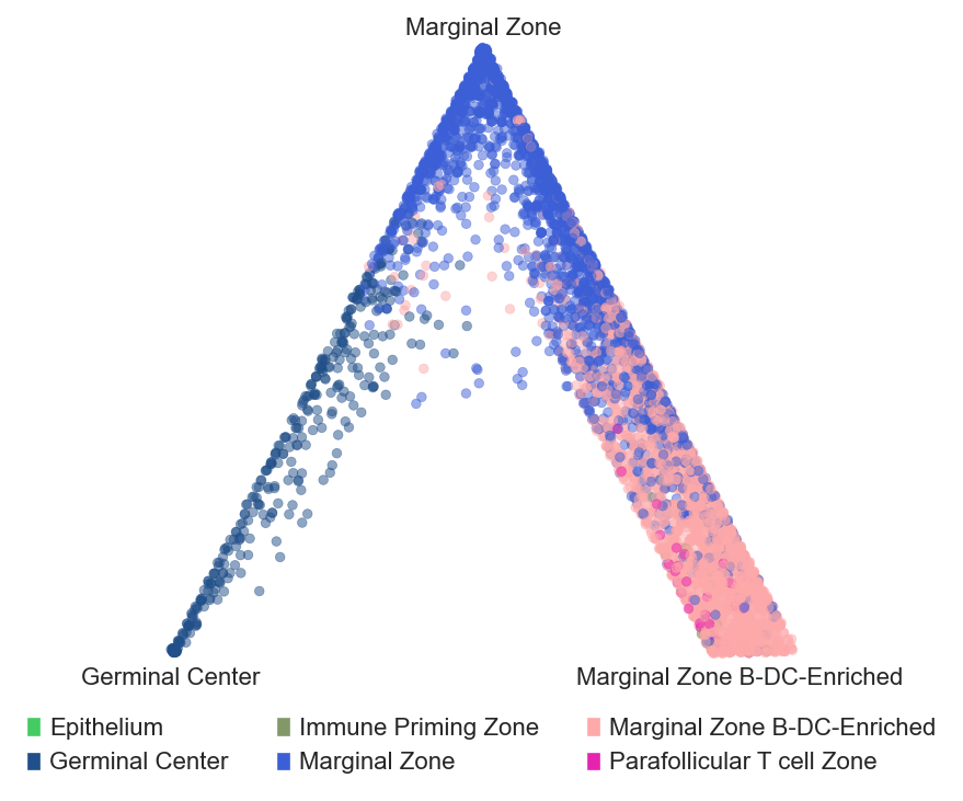
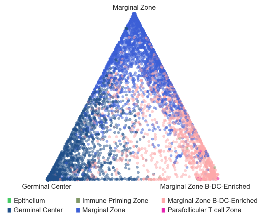
Barycentric coordinates plot
# plot barycentric projections for the tonsil and tonsillitis data

sp.pl.BC_projection(adata=adata_tonsil,
    cnmap_dict = cnmap_dict_tonsil, # dictionary from the previous step
    cn_col = "CN_k20_n6_annot", # column with CNs
    plot_list = ['Germinal Center', 'Marginal Zone','Marginal Zone B-DC-Enriched'], # list of CNs to plot (three for the corners)
    cn_col_annt = "CN_k20_n6_annot", # column with CNs used to color the plot
    palette = None, # color dictionary
    figsize=(5, 5), # figure size
    rand_seed = 1, # random seed for reproducibility
    n_num = None, # number of neighbors
    threshold = 0.6) # threshold for percentage of cells in CN

sp.pl.BC_projection(adata=adata_tonsillitis,
    cnmap_dict = cnmap_dict_tonsillitis,
    cn_col = "CN_k20_n6_annot",
    plot_list = ['Germinal Center', 'Marginal Zone','Marginal Zone B-DC-Enriched'],
    cn_col_annt = "CN_k20_n6_annot",
    palette = None,
    figsize=(5, 5),
    rand_seed = 1,
    n_num = None,
    threshold = 0.6)