CODEX human healthy intestine
import spacec as sp
import scanpy as sc
import pandas as pd
import numpy as np
import matplotlib.pyplot as plt
from scipy.spatial import KDTree
import warnings
warnings.filterwarnings("ignore")
output_dir = "/output/"
adata = sc.read_h5ad("/adata.h5ad")
adata
AnnData object with n_obs × n_vars = 832321 × 27
    obs: 'DAPI', 'x(um)', 'y(um)', 'area(um^2)', 'unique_region', 'ObjectID', 'leiden_gpu_1', 'broad_anno', 'subcluster_1', 'subcluster_1_anno', 'subcluster_2', 'subcluster_2_anno', 'subcluster_3', 'subcluster_3_anno', 'subcluster_4', 'subcluster_4_anno', 'batch', 'cell_type'
    uns: 'dendrogram_subcluster_4_anno', 'neighbors', 'subcluster_4_anno_colors', 'umap'
    obsm: 'X_umap'
    obsp: 'connectivities', 'distances'
# Create a color dictionary for cell types in adata.obs
# All cell types except 'Vessel' will be grey, while 'Vessel' will be red
color_dict = {ct: "red" if ct == "Vessel" else "grey" for ct in adata.obs["cell_type"].unique()}
print(color_dict)
{'Macrophage': 'grey', 'CD4+ T cell': 'grey', 'APC': 'grey', 'NK cell': 'grey', 'CD8+ T cell': 'grey', 'Granulocyte': 'grey', 'Treg': 'grey', 'mixed immune': 'grey', 'Monocyte': 'grey', 'Tumor': 'grey', 'Vessel': 'red', 'Smooth Muscle': 'grey'}
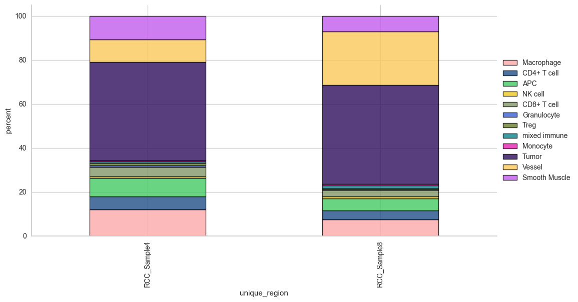
Cell type composition
# cell type percentage tab and visualization [much few]
ct_perc_tab, _ = sp.pl.stacked_bar_plot(
    adata = adata, # adata object to use
    color = 'cell_type', # column containing the categories that are used to fill the bar plot
    grouping = 'unique_region', # column containing a grouping variable (usually a condition or cell group)
    cell_list = adata.obs['cell_type'].unique(),  # list of cell types to plot, you can also see the entire cell types adata.obs['celltype_fine'].unique()
    palette=None, #default is None which means the color comes from the anndata.uns that matches the UMAP
    savefig=True, # change it to true if you want to save the figure
    output_fname = "Barplot_cell_types", # change it to file name you prefer when saving the figure
    output_dir = output_dir, #output directory for the figure
    norm = False, # if True, then whatever plotted will be scaled to sum of 1
    fig_sizing= (12,6)
)
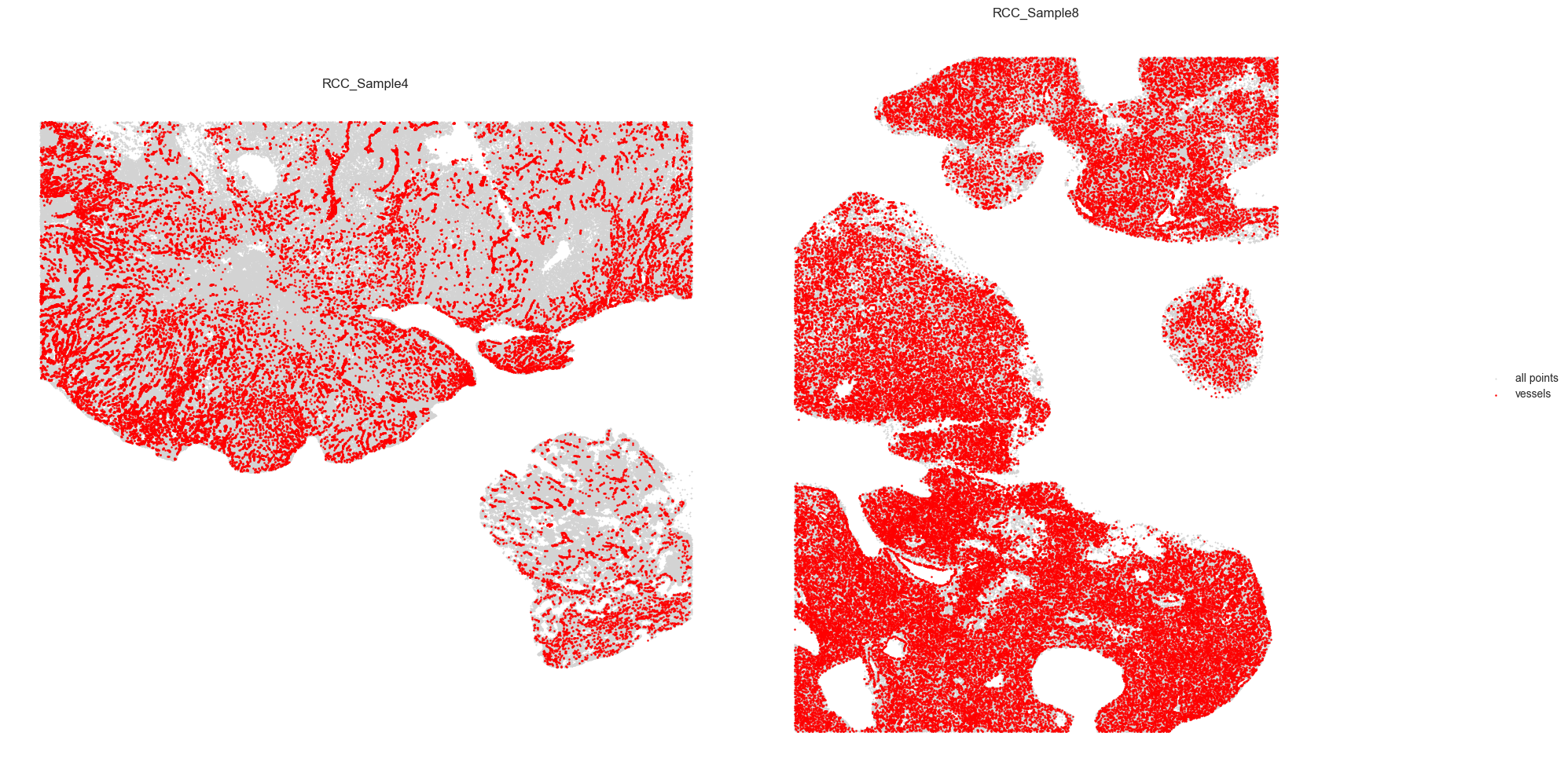
Vessel tracing
adata.obs['vessel'] = adata.obs['cell_type'].apply(lambda x: 'Vessel' if x == 'Vessel' else 'Other')
# Prepare vessel data
df = adata.obs[['x(um)', 'y(um)', 'vessel', 'unique_region']].copy()
df.columns = ['x', 'y', 'vessel', 'unique_region']

# Filter to vessels only
vessels = df[df['vessel'] == 'Vessel']

# Separate by region (adjust region names as needed)
vessels_A = vessels[vessels['unique_region'] == 'RCC_Sample4'].reset_index(drop=True)
vessels_B = vessels[vessels['unique_region'] == 'RCC_Sample8'].reset_index(drop=True)

def plot_vessels(ax, vessels, all_df, threshold, color):
    coords = vessels[['x', 'y']].to_numpy()
    tree = KDTree(coords)
    pairs = tree.query_pairs(r=threshold)

    # All points background
    ax.scatter(all_df['x'], all_df['y'], color='lightgray', s=1, label='all points')
    ax.scatter(vessels['x'], vessels['y'], color=color, s=2, label='vessels')

    for i, j in pairs:
        ax.plot([coords[i][0], coords[j][0]], [coords[i][1], coords[j][1]], color=color, linewidth=1)

    ax.set_aspect('equal')
    ax.set_xticks([])
    ax.set_yticks([])
    ax.set_title(f'{vessels["unique_region"].iloc[0]}')
    ax.set_frame_on(False)

# Plot side by side
fig, axes = plt.subplots(1, 2, figsize=(20, 10))
threshold = 5

plot_vessels(axes[0], vessels_A, df[df['unique_region'] == 'RCC_Sample4'], threshold, color='red')
plot_vessels(axes[1], vessels_B, df[df['unique_region'] == 'RCC_Sample8'], threshold, color='red')

# Move legend to the side
handles, labels = axes[0].get_legend_handles_labels()
fig.legend(handles, labels, loc='center right', frameon=False)

plt.tight_layout(rect=[0, 0, 0.9, 1])  # leave space on the right for the legend
plt.show()
Patch proximity analysis
# this region result is also saved to adata.uns
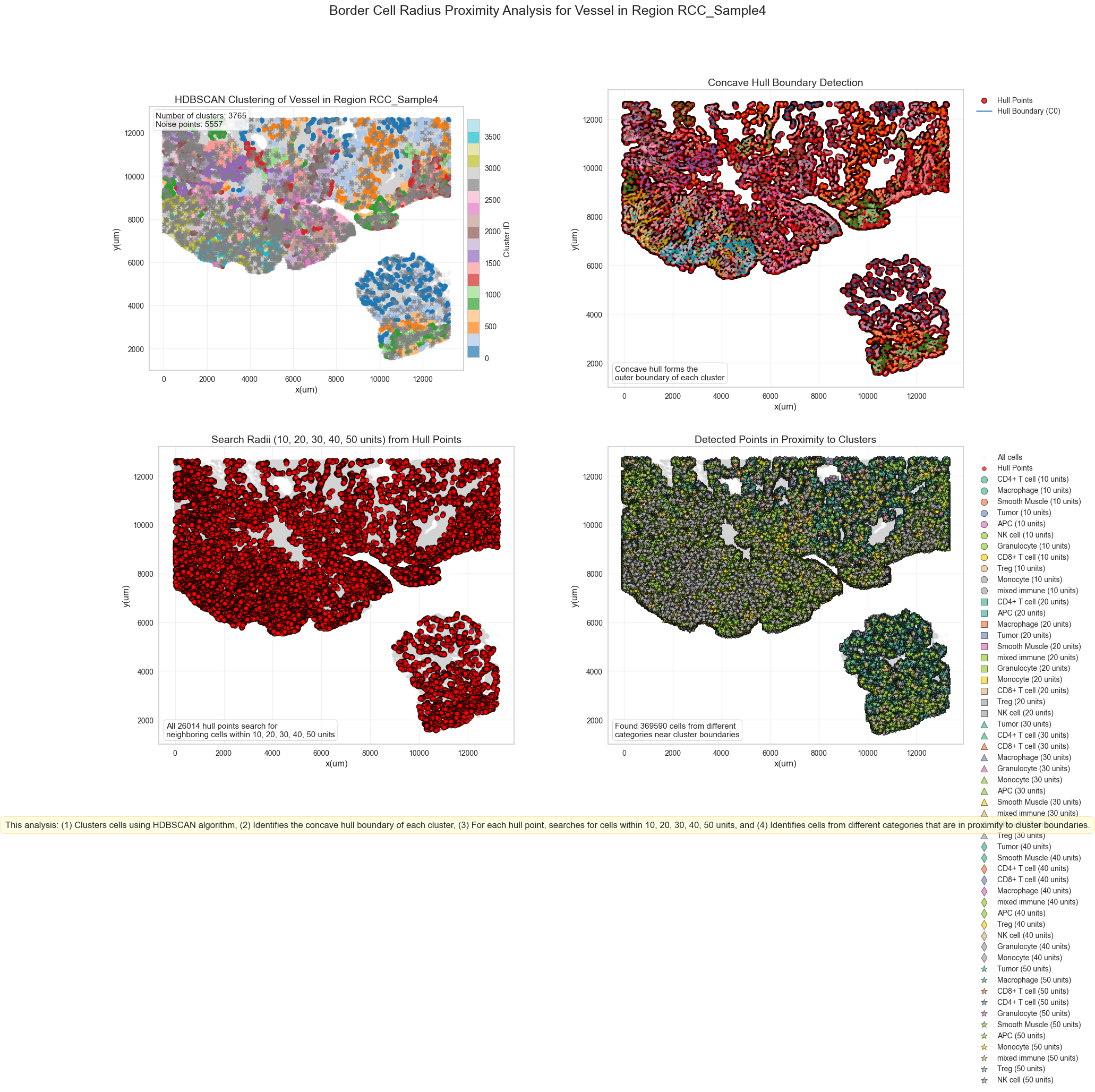
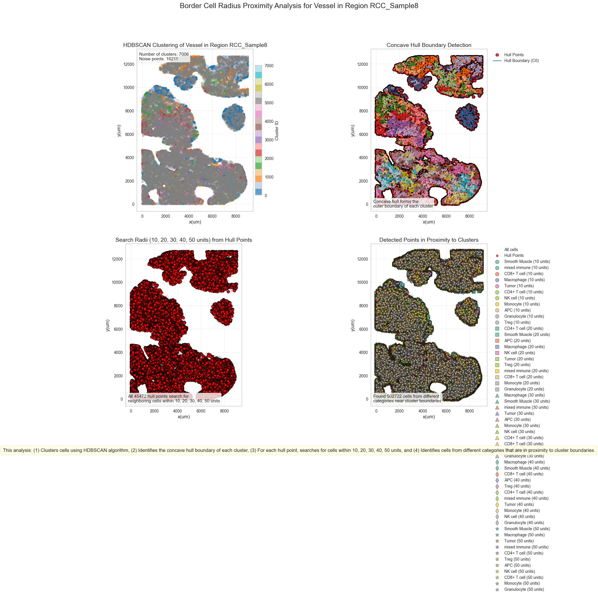
results, outlines_results = sp.tl.patch_proximity_analysis(
adata, # the annotated adata object
region_column = "unique_region", # column with the region information
patch_column = "cell_type", # column with the patch information (derive patches from this column)
group="Vessel", # group to consider
min_cluster_size=3, # minimum cluster size to consider
x_column='x(um)', y_column='y(um)', # spatial coordinates
radius = [10, 20, 30, 40, 50], # to get the distance in µm
edge_neighbours = 1, # number of neighbours to consider for edge detection if set to 1 only the hull is considered
plot = True, # plot the results for demonstration and/or documentation (set to False to skip plotting - improves speed)
original_unit_scale = 1, # scale factor for the units (1 = 1px per unit e.g. µm)
method= "border_cell_radius", # method to use for the edge detection
key_name = "ppa_result_20_40_60_80_100_border_cell_radius", # key name to store the result in adata.uns
save_geojson = False, # save the results as geojson
) # plot detection for demonstration purposes
Processing RCC_Sample4_Vessel
Estimated number of clusters: 3765
Estimated number of noise points: 5557
Warning: Failed to create visualization for region RCC_Sample4: Colorbar layout of new layout engine not compatible with old engine, and a colorbar has been created.  Engine not changed.
Finished RCC_Sample4_Vessel
Processing RCC_Sample8_Vessel
Estimated number of clusters: 7006
Estimated number of noise points: 16211
Warning: Failed to create visualization for region RCC_Sample8: Colorbar layout of new layout engine not compatible with old engine, and a colorbar has been created.  Engine not changed.
Finished RCC_Sample8_Vessel
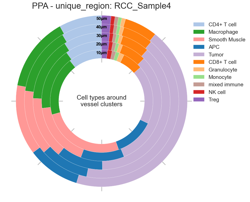
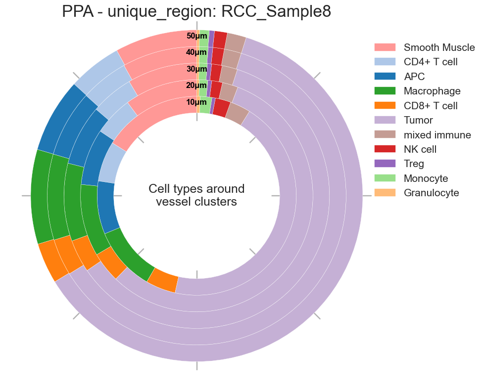
# Donut plots for cell types around Germinal Center
sp.pl.ppa_res_donut(
    adata,
    cat_col = 'cell_type',
    key_name="ppa_result_20_40_60_80_100_border_cell_radius",
    palette=None,
    distance_mode="within",  # "within" or "between"
    unit="µm",
    figsize=(10, 10),
    add_guides=True,
    text="Cell types around vessel clusters",
    label_color="black",
    group_by= 'unique_region',
    title="PPA",
    savefig=True,
    output_dir=output_dir,  # Specify your output directory
)
Creating visualization for unique_region = RCC_Sample4
Radius 10: 32951 cells
Radius 20: 115328 cells
Radius 30: 194984 cells
Radius 40: 277954 cells
Radius 50: 369590 cells
Creating visualization for unique_region = RCC_Sample8
Radius 10: 41798 cells
Radius 20: 150552 cells
Radius 30: 257863 cells
Radius 40: 372736 cells
Radius 50: 502722 cells
{'RCC_Sample4': <Figure size 1000x1000 with 1 Axes>,
 'RCC_Sample8': <Figure size 1000x1000 with 1 Axes>}